Most businesses struggle with creating effective landing pages that convert visitors into customers. If you want to boost your conversion rates and generate more leads, you need to craft a compelling landing page. In this guide, you will learn key strategies and best practices to create a landing page that drives results for your business.
Key Takeaways:
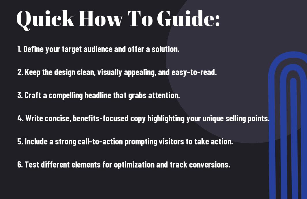
- Clear Call-to-Action: Including a strong and clear call-to-action on your landing page can significantly improve conversion rates.
- Engaging Visuals: Utilizing high-quality and relevant visuals such as images or videos can capture the attention of visitors and increase interest in your offer.
- Minimalist Design: Keeping the design of your landing page clean and simple helps visitors focus on the key information and encourages them to take action.
Understanding the Fundamentals of a High-Converting Landing Page
Defining Your Target Audience
A crucial aspect of creating a high-converting landing page is defining your target audience. This involves understanding who your ideal customers are, what their needs and pain points are, and how your product or service can provide a solution for them. Assuming you have a clear understanding of your target audience, you can tailor your landing page content, design, and call-to-action to speak directly to their needs and desires.
Identifying Your Unique Selling Proposition (USP)
You need to clearly identify your Unique Selling Proposition (USP) to set your business apart from competitors and convince visitors to choose your offering over others. Your USP should highlight the most important and beneficial aspects of your product or service that address the key pain points of your target audience.
Your USP should be prominently displayed on your landing page and should be the focal point of your messaging. This is your opportunity to showcase what makes your business unique and why potential customers should choose you over the competition.

Crafting a Compelling Headline and Hero Section
How to Write a Headline that Grabs Attention
Write a headline that grabs attention and entices visitors to stay on your landing page. Your headline should be clear, concise, and compelling. Use action words to prompt users to take the desired next step. Consider posing a question that resonates with your target audience or highlighting a key benefit of your product or service.
Creating a Hero Section that Converts
Hero sections are the first thing visitors see and can make or break their decision to stay on your page. This section typically includes a headline, subheadline, and call-to-action button. Your hero section should clearly communicate the value proposition of your offering and guide visitors towards the desired action. Keep it visually appealing and consistent with your brand’s aesthetics to build trust and credibility.
This crucial section of your landing page sets the tone for the visitor’s journey and can greatly influence conversion rates. Make sure your hero section is well-designed, persuasive, and optimized for the best possible user experience.
Best Practices for Hero Images and Videos
Images and videos in the hero section can enhance engagement and convey your message effectively. Choose high-quality visuals that relate to your product or service and resonate with your target audience. Ensure that the media content is relevant and complements the text on the page. Opt for a video if it helps to demonstrate your product in action or tells a compelling story about your brand.
Headline: Ensure that the headline in your hero section is clear, concise, and compelling to capture the visitor’s attention and encourage them to explore further.

Building Trust with Social Proof and Credibility Indicators
The Power of Customer Testimonials
Not only do customer testimonials help to build trust with potential customers, but they also serve as social proof of the value of your products or services. When visitors to your landing page see positive feedback from satisfied customers, they are more likely to trust your business and make a purchase. To maximize the impact of customer testimonials, consider including specific details about the customer’s experience and results they achieved by using your product or service.
Showcasing Expert Endorsements and Partnerships
You can enhance your credibility by showcasing expert endorsements and partnerships on your landing page. Little mentions from well-known industry experts or collaborations with reputable brands can go a long way in building trust with your audience. When visitors see that established experts or companies are endorsing your business, they will be more inclined to view you as a reliable and trustworthy source.
Displaying Trust Badges and Security Certifications
For maximum credibility, displaying trust badges and security certifications on your landing page can help alleviate any concerns that potential customers may have about the safety of their personal information. These badges indicate that your site is secure and that transactions are encrypted, giving visitors peace of mind when making a purchase or sharing their data with you.
Designing a Clear and Concise Value Proposition
Communicating Your Unique Value Proposition (UVP)
Clear communication of your Unique Value Proposition (UVP) is crucial for creating a high-converting landing page. Your UVP is what sets your business apart from the competition and explains why a potential customer should choose your product or service over others. Make sure your UVP is prominently displayed on your landing page so that visitors can immediately understand the benefits of engaging with your business.
Breaking Down Complex Offers into Simple Terms
Unique offers can sometimes be overwhelming for visitors to comprehend. To ensure that your landing page effectively communicates the value of your offer, break down complex terms into simple and easily digestible information. Use clear language and avoid jargon to make it easy for visitors to understand the benefits of your product or service.
Understanding your audience’s level of comprehension is key when simplifying complex offers. By speaking their language and breaking down information into simple terms, you can ensure that visitors understand the value you are providing and are more likely to convert.
Using Visuals to Enhance Understanding
An effective way to enhance the understanding of your value proposition is to use visuals on your landing page. Visual elements like images, infographics, and videos can help convey your message more effectively than text alone. By incorporating visual aids, you can capture the attention of your audience and communicate your value proposition in a more engaging manner.
Communicating your value proposition clearly and concisely through visuals can help reinforce your message and make it more memorable for visitors. Visual content not only enhances understanding but also improves the overall user experience, leading to higher conversion rates for your business.
Optimizing Your Call-to-Action (CTA) for Maximum Conversions
Now, to ensure that your landing page is driving the desired actions from your visitors, optimizing your Call-to-Action (CTA) is crucial. If you’d like to learn more about creating a high-converting landing page, check out the comprehensive guide on How to Build a High-Converting Landing Page: Anatomy, Tips, and Examples.
Crafting a Clear and Direct CTA
Direct and concise CTAs tend to perform best. Make sure your CTA clearly states what action you want the visitor to take, such as ‘Sign Up Now’ or ‘Get Started Today’. Avoid vague language and ensure that your CTA stands out visually on the page. A compelling CTA can significantly boost your conversion rates and drive more engagement from your audience.
Choosing the Right CTA Button Color and Design
Choosing the right color and design for your CTA button can make a big difference in grabbing the user’s attention. To maximize conversions, consider using a color that contrasts with the rest of your page and stands out. Test different colors to see which one resonates best with your audience – sometimes a simple change in button color can lead to a substantial increase in conversions.
To further enhance the effectiveness of your CTA button, make it visually appealing by using a design that is easy to click on both desktop and mobile devices. The button should be large enough to be noticed right away but not too overpowering that it detracts from the rest of the page’s content.
Strategic Placement of CTAs for Maximum Impact
Your CTAs should be strategically placed throughout your landing page to maximize their impact. Consider placing CTAs above the fold so that visitors don’t have to scroll to find them. Additionally, including CTAs at the end of compelling content sections can capitalize on the reader’s interest and prompt them to take action.
Make sure your CTAs are not only visible but also well-spaced to avoid overwhelming your visitors. By strategically placing your CTAs where they are most likely to be seen and clicked on, you can increase your conversion rates and drive more valuable leads for your business.
Mobile Optimization and User Experience Factors
To ensure that your landing page is optimized for mobile users, there are several key factors to consider that can improve conversion rates and user experience. Here are some crucial tips to help you create a high-converting landing page for mobile users:
Ensuring a Seamless Mobile Experience
While designing your landing page, make sure that it is fully responsive and adapts to different screen sizes. Your CTA buttons should be prominent and easy to tap on a mobile device. Additionally, optimize your images and videos for quick loading times without compromising quality. This will provide a seamless experience for users across all devices.
Simplifying Navigation and Reducing Friction
If your landing page has a longer form or requires scrolling, consider breaking it up into smaller sections to make it easier for users to digest the information. A clean layout with clear headings and bullet points can help users navigate the page effortlessly. This reduces friction and improves the overall user experience, increasing the likelihood of conversion.
A cluttered layout with too much text or distracting elements can overwhelm users and lead to higher bounce rates. By simplifying the navigation and reducing friction, you can guide users towards your conversion goal more effectively.
Load Time and Performance Optimization Tips
User experience is greatly influenced by the load time and performance of your landing page. Here are some tips to optimize load time and performance:
- Optimize images and videos
- Minimize HTTP requests
- Enable caching
The faster your landing page loads, the better the user experience and the higher the chances of conversion. The performance of your page can impact your SEO ranking as well, so it’s crucial to prioritize speed and responsiveness.
Seamless integration of these mobile optimization and user experience factors will lead to a high-converting landing page that not only attracts visitors but also drives them to take action. By focusing on providing a smooth and engaging experience, you can maximize the effectiveness of your digital marketing strategy.
Summing up
Upon reflecting on the key components and strategies to create a high-converting landing page for your business, remember that simplicity is key. By creating a clear and concise message, utilizing appealing visuals, incorporating a strong call-to-action, and ensuring seamless navigation, you can attract and engage your target audience effectively.
Additionally, regularly testing and optimizing your landing page based on data and visitor behavior will help you continually improve its performance and conversion rates. By following these best practices and staying abreast of current trends in digital marketing, you can create a landing page that not only captures attention but also drives meaningful results for your business.